This is our completed film opening - 24 Hours. We constructed this opening over a couple of months, as a group each individual developed many skills on different programs including Final Cut Pro and Garage Band. Throughout the task we worked well as a group as we communicated well and helped each other to complete the coursework.
Monday, 9 May 2011
Wednesday, 13 April 2011
Looking back at the preliminary task, what do you think you have learnt from the progression from it to the full task?
What have you learnt about technologies from the process of constructing this product?
We believe it was better to answer this question visually as the viewers will remember much more from visual videos explaining factors instead of the answer being written down.
How did you attract/address your audience?
Firstly, our film opening would typically attract both male and females aged 15-24. In order to keep the viewers attention, we introduced the characters slowly, and when the action started, we added a sound track put together by ourselves, to build up suspense. This helps to keep the attention of the audience as it changes from a slow introduction and gradually speeds up. Also, we used lots of short clips of our filming in order to create a sense of urge when Dwayne realizes his girlfriend has been kidnapped.Secondly, we include many flashbacks to subtly inform the viewer what has happened, and why Dwayne is in a rush. The different types of shots, such as long shots and extreme close ups makes the viewer focus on those objects which may be vital later in the film. Also, the extreme close ups allow the viewer to imagine they are the actor, and see it from their point of view. We added a saturated effect to the flashbacks to show the viewers that this has already happened and it is in the past, which also helps to keep the audience interested.

 We have a mixture of diegetic and non-diegetic sound in our opening but to build up the suspense, it was important to add a sound track to our film opening, rather than to leave diegetic sound because our sound track we added plays a major part to building up the suspense. Our diegetic sound includes the start of the ignition, and revving of the engine. This breaks up the non-diegetic sound and these particular sounds emphasise the importance of Dwayne reaching his girlfriend.
This sound in our opening film is diegetic. It was natural sounds within our filming.
This sound in our opening film is non-diegetic. We aded the sound during editing to add the impression it is Emma's heart beating.
Finally, we specifically chose to have very little lighting in order to disguise the kidnapper and by doing this it means the user has to focus closely in order to realize who he is. It means the audience are intrigued and don't want to look away incase they miss something.
Who would be the audience for your media product?
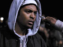
 The film will attract both males and females as it includes and portrays both genders in stereotypical ways. In our film opening, Lucy appears vulnerable and is easily intimidated by boys of a similar age. This relates to society because many young girls feel this way, and in particular by others of a similar age. She has been kidnapped by a thug, dressed in dark clothing, a typical representation for teenagers. Warren is portrayed as an aggressive male teenager who prays on young females. He threatens Dwayne in the opening sequence which makes him seem better than everybody else although they challenge him.

What kind of media institution would distribute your media product and why?
 Film 4 also distributes low budget films and would therefore also be a suitable distribution company for our film. Film 4 productions is owned by Channel 4 and aswell as distributing low budget films, it also distributes some larger budget films such as Lovely Bones.

How does your media product represent particular social groups?
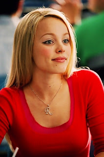
 The person being kidnapped is young blonde white female; again this is very stereotypical as she is seen as a “dumb blonde” stupid and gullible. She has no control over the situation is also very powerless, weak and vulnerable. Similarly with this the girl is wearing very basic clothing, brown boots, leggings and top, We see her in the opening scene tied to a chair with the kidnapper, there is nothing she can do to prevent the situation.
In what ways does your media product use, develop or challenge forms and conventions of real media products?
Monday, 7 March 2011
Location
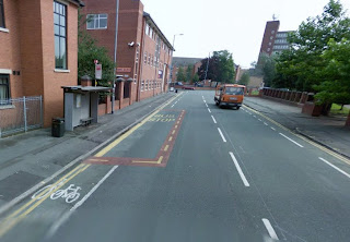 This is a picture of the location used for when Lucy's phone
is left at the bus stop.
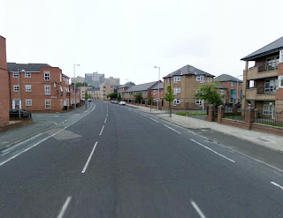
This is a picture of the location used for the car; when Dwayne
gets in his car and speeds off.
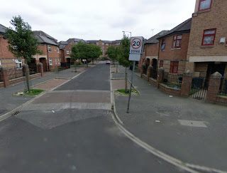 This is a picture of the location used for when Lucy
is walking down the street and Antonio is behind her. We used typical urban surroundings as it shows originality and fits our genre.
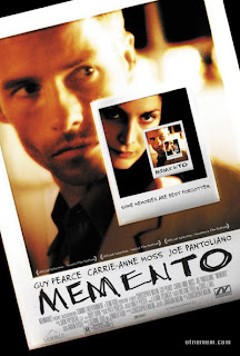
Memento Analysis

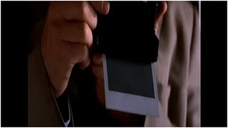
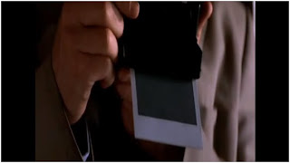
The background then changes to some ones hand holding a photograph and consists of very low key ambient lighting which links in with the way we want to create the opening scene to our film. The photograph has blood on it, which creates a psychological effect on our minds and gets us thinking about the reason for this rather than showing violence. This continues through most of the opening scene. The photograph is also taken with an old fashioned camera as we can tell from the style of the photograph it’s self. This gives it quite an antique effect rather than using a very modern digital camera. This part of the scene is shot using extreme close up so we get to see all the detail we need. There are no other types of shot at this part for example long shot as they wouldn’t give the same dramatic effect on the scene.
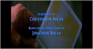
At about 30 seconds in we get the impression that the scene has been created backwards. As the handshakes the photograph the sharp red begins to fade within seconds after it. The picture after being taken would normally become clear but instead becomes a very dirty colour white. This is very unusual along with flashbacks for an opening of a film. We then see the photograph going back into the camera and a photograph is taken. At this point the credits fade out completely and the low key lighting effect changes to become brighter.
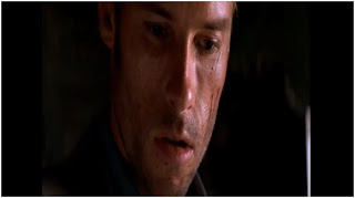
We then see the man who took the photograph he is also in extreme close up. The worried confused expression on his face shows us that he is unsure of maybe what is happening. His face makeup looks very dirty which has been deliberately done draws attention to the sharp red cuts on his face. This again gets us thinking psychologically about why he has this and what is happened. He looks quite shocked and worried almost as if he doesn’t really know or understand what is going on. As the camera moves very slowly it builds up a lot of tension.
The low key ambient lighting is still continued. We then have an extreme close up of dark red blood dripping backwards on the wall, however in does seem very clear in comparison to the photograph of what has been taken. We then see a man that has just been shot. This all happens very quickly and there is no time for the man to do anything. This is very unusual opening to a film as films do not normally start backwards. As we see the man on the floor which has been shot in a close up we get a look of part of the room, which looks very plain and basic like a rundown building, the floor looks very dirty and uneven. This could possibly have been shot this way so that a claustrophobic effect is created.
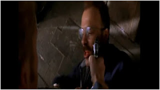
At the end of the opening the colour style changes to a black and white tint which links in to the very old fashioned camera effect as the camera slowly moves up his face. This is the point where the man hasn’t been shot and psychologically makes us think about what is going through the mans mind, as he has no expressions on his face to show what he is about to do or in this case “has just happened” due to the opening being backwards. This could suggest that maybe the man is so psychologically harmed inside he doesn’t understand the effects of what he is doing. This part is in extreme close up and continues to the end of the opening scene.

Monday, 28 February 2011
Wednesday, 16 February 2011
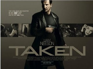
'Taken' Analysis
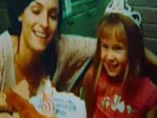
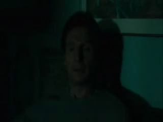
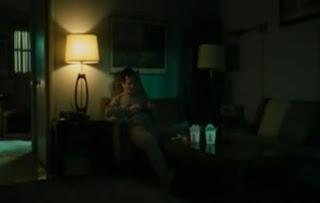
The flashback birthday party is in any case would be more of a celebration (a happy memory) but in this case it seems more of a bad memory. He then turns the light on in where the viewers can see a focus on him but the props (take-away boxes) show that he lives a lonely/quiet world.
First, it was recorded on an extreme close up but now recorded on a medium-long shot. This may be for the viewers to identify the man's surroundings and maybe show them the kind of conditions he's living in. It shows the difference and creates a contrast between the video footage seen in the flashback; that was the life he was living and now it feels like he's lost it all.
In later scenes in the film, the viewers believe they will be given the reason why everything has changed for this 'lonely' man. He then picks up a picture of a little girl (probably his daughter) and looks at it for a good couple of seconds, when he puts the picture down you can tell by his facial expression that he misses her and want to put things right. From what I can tell as a viewer it seems like the attention is all on his daughter. This creates an emotional connection so viewers feels empathy towards the daughter.
Production Treatment
Genre: Thriller
Duration: Approximately 2 minutes
Audience: Our target audience will be late teens to early twenties, so around the 16-25 range. Although it may attract some older attention.
Resume: The opening of our film will tell two stories at once by consistent flashbacks of what has previously happened in order to indirectly explain the purpose of the other story.
The flashback will show the lead up to the kidnapping, so Emma waiting at the bus stop for Mo to collect her, but he never does. At the same time, we will show Mo receiving a threatening phone call from the kidnapper and him making his way to where he should of collected Emma from, but instead he finds her phone and bag.
Suggested Elements
Performance
Emma: Stands waiting for Mo to pick her up, shivering because she is cold.
Mo: firstly, Mo appears calm and chilled, but then he speeds up his pace to emphasise the importance of saving Emma.
Costumes
Emma: Casual clothing. Leggings, Uggs and a jacket.
Mo: Gang related clothing. Black jeans, red hoody and a black jacket.
Antonio: Gang related clothing.Black tracksuit bottoms, black tracksuit jacket with a hood.
Props
We will use several phones throughout the opening of the film, Emma's bag.
Key Locations
Bus stop
Mo's House - living room
Title/Opening Credits
LEMA presents
Director: Louise Atkinson
Writer: Mohammed Abubakar
Louise Atkinson
Emma Cousins
Antonio Paulo
Characters
Lucy: Emma Cousins
Dwayne: Mohammed Abubakar
Warren: Antonio Paulo
Recording Days
Filming (pre-production)
- 28th february - 9th march
During this week we will aim to film the majority of our opening scene, although we may need to film into the next week aswell.
Editing (post production)
-9th march - 30th march
We will begin editing as soon as we have finished filming. We may have to re-shoot some of our shots so therefore will make the process longer.
Monday, 14 February 2011
Main Task - Shotlist
- Opening Credits - Black screen with white texts to make the text stand out. The role in smaller text and the name of the student in larger font to emphasise the name.
- A sound bridge of the phone ringing will link the two scenes. Close up of the phone ringing. The setting of this would be in a living room or maybe bedroom - a room where it's dark to create an intense start to the film.
- Zoom out from previous scene so viewers can see 'Mo' in the shot which. will show a shallow depth of field, the focus was first on the phone whilst 'Mo' is blurry but reverses to the telephone being blurry and now the focus is on 'Mo'.
- This will be a flashback. A long shot of Emma walking home. She will be on her phone texting. The location will be dark with very little lighting and on a quiet road. We will add a different effect to this so that the viewer can identify that it has already happened.
- Mo answers the phone with some hesitation.
- We will split the screen for this scene so that both characters can be seen at the same time. Both characters will stand with the phone against their ear. Both will be in different locations, Antonio walking quickly down a busy road and Mo inside his house. The conversation will take place during this scene.
- Back to a flashback of Emma texting. This time we will zoom in on the phone screen to focus on what she is texting and who she is texting.
- Medium close up of Mo still on the phone to Antonio looking worried. The phone then ends with the "end tone" which we will use from Garage band.
- Mo slowly takes the phone from his ear, as he slowly takes in what has just be said to him and replaces the phone back on the table.
- Flashback of Mo at his house receiving Emma's text.
- Shot of Mo leaving his house. First shot is him opening the door, the next shot is Mo exiting the house.
- Long shot flashback which shows Emma walking with Antonio in the background, following her. This scene will have low key lighting also.
- We see Mo get into his car and start the ignition. The lighting here will be brighter, natural daylight.
- Extreme close up of the car wheel to show Mo speeding off.
- Flashback of Emma's phone lying on the ground ringing out. A sound bridge will link the two scenes.
- Long shot of Mo bringing the car to a sharp standstill, where he should have been picking Emma up.
- Mo finds the phone alongside Emma's bag, coincidently a her phone receives a text at the same time.
- Flashback to Emma in a dark room, alone.
- Black screen and '24 hours' appears on the screen in a large white font.
Monday, 7 February 2011
Thursday, 3 February 2011
Evaluation of Preliminary Task
What did you learn about the camera and editing software during the preliminary task?
During filming our preliminary task, we learnt how to use some of the much-important features of the camera. In our group, two of the students are A2 students and have already produced a music video so therefore were able to help the others in our group to use the cameras quite quickly.
Due to the two A2 students, we was able to record and edit in a short space of time due to the experience gained from the production of their music videos.
We also learnt how to fix the camera at different angles to create a greater effect on the footage overall. We extended the legs of the tripod to help us to film from a high angle shot of Mohammed running up the stairs and also a low angle shot close up of his feet. When filming, we built on our knowledge to position the camera in different places in order to create different views and help with our continuity editing. The advantage of taking so many different types of shots of the same scene is that we were able to choose and pick the best angles and it gives our preliminary task a professional cut.
Secondly, we learnt and developed our editing skills on Final Cut Pro 7. Some of us had not used the editing software before and was a completely new experience but due to the help of others in our group we was able to work together and put our video together. Before we could start editing our filming, we had to convert our footage using MPEG Stream clip which was a task easily completed.
We used an editing keyboard to quickly edit our footage, from the keyboard we learnt how to ‘mark in’ and ‘mark out’ which allowed us to cut out the footage not needed from the start and the end.
We also learnt how to add effects which makes our video fit together easier., using effects also creates different types of atmosphere and it also makes the audience/viewers think about why the effect was used, what was its purpose which we want, we want a spontaneous edge to our preliminary task.
A the end of the video, we used the fade effect, this simply faded out the end scene which adds more of a professional view.
In the filming and editing of your project, what worked well and what could have been improved?
In our project, what worked well is that our video had a good standard of continuity. We edited to make sure all the scenes more or less matched the previous ones, we had a lot of footage, which was another thing that gave us an advantage, we could choose from different type of scenes, from different angles therefore our continuity was standard and would do nothing to change it in this particular task. Having a standard continuity indicates this task was done at a professional pace. Another point was we had a fade out which works out well because it’s a sign of closure, to close the scene and let the audience and viewers know that it was the end of the scene. The last point that worked well in our video was when Mohammed was running upstairs (rushing), we recorded plenty footage for this particular scene. In the video, we have a combination of, high angle shot, medium, close-up and extreme close up shots. We had covered most angles, which was great, as we had completed our task in a great standard. However, our dialogue in the preliminary task was to a great standard, it was only a 35-second clip, which is very short. The actual dialogue was short as it was only a couple of words from two different characters. The reason for this would be the group planning, we didn’t plan to as much detail as what could’ve performed. Another area in where we could’ve improved on is the sound. The use of non-diagetic was nil, we could’ve used this to create some sort of theme to let the viewers know what kind of genre the video is. Also non-diagetic sounds also create some sort of anxiety, some sort of rhythm that goes with the video clip. Also we could’ve improved on the diagetic sounds, the two main characters should have maybe spoken more louder or closer to the camera, this would be because maybe the older generation may have hearing problems and with the improvement, they will be more likely to hear the footage.
Give a detailed, specific example of how you have used a shot/reverse shot combination in your film.
In our short video, we have used a shot/reverse shot combination to show the dialogue between Mo and Antonio. This shot shows the two characters interacting with each other when Mo enters the room and confronts Antonio about his phone, an insert of the Blackberry, and then a low angle shot of Mo then cutting back to Antonio.
Give a detailed, specific example of how you have achieved match cuts during the editing process.
During our editing process, we used match cuts to make the editing look smooth and continuous. We achieved this by filming more footage than we needed to, which enabled us to edit the shots together easily. An example of this in our video is when Mo is running up the stairs. There are several cuts that fit together of Mo at different places on the stairs. Because these shots match, it prevents the viewer from being distracted.
How did you achieve continuity in this task? Or if your transitions weren't entirely smooth, what have you learnt from this?
We achieved continuity in our short video by carefully editing our filming together. In order to achieve this, we had to plan ahead and film the same sequence several times from a different prospective. By doing this, during editing on Final Cut Pro 7, we were able to easily fit our filming together as we had too much footage. It was better for us to film too much than not enough, because otherwise we would have realised during editing, that the sequence didn't match and would have had to go out and re-film certain aspects of our video.


